KeepSafe is a digital service that strengthens the relationship between homeless people seeking social housing and their caseworkers by making personal documents secure and accessible. By reducing frictions associated with losing personal documents and moving between caseworkers, KeepSafe makes it easier for the homeless to achieve their goal of finding permanent housing.
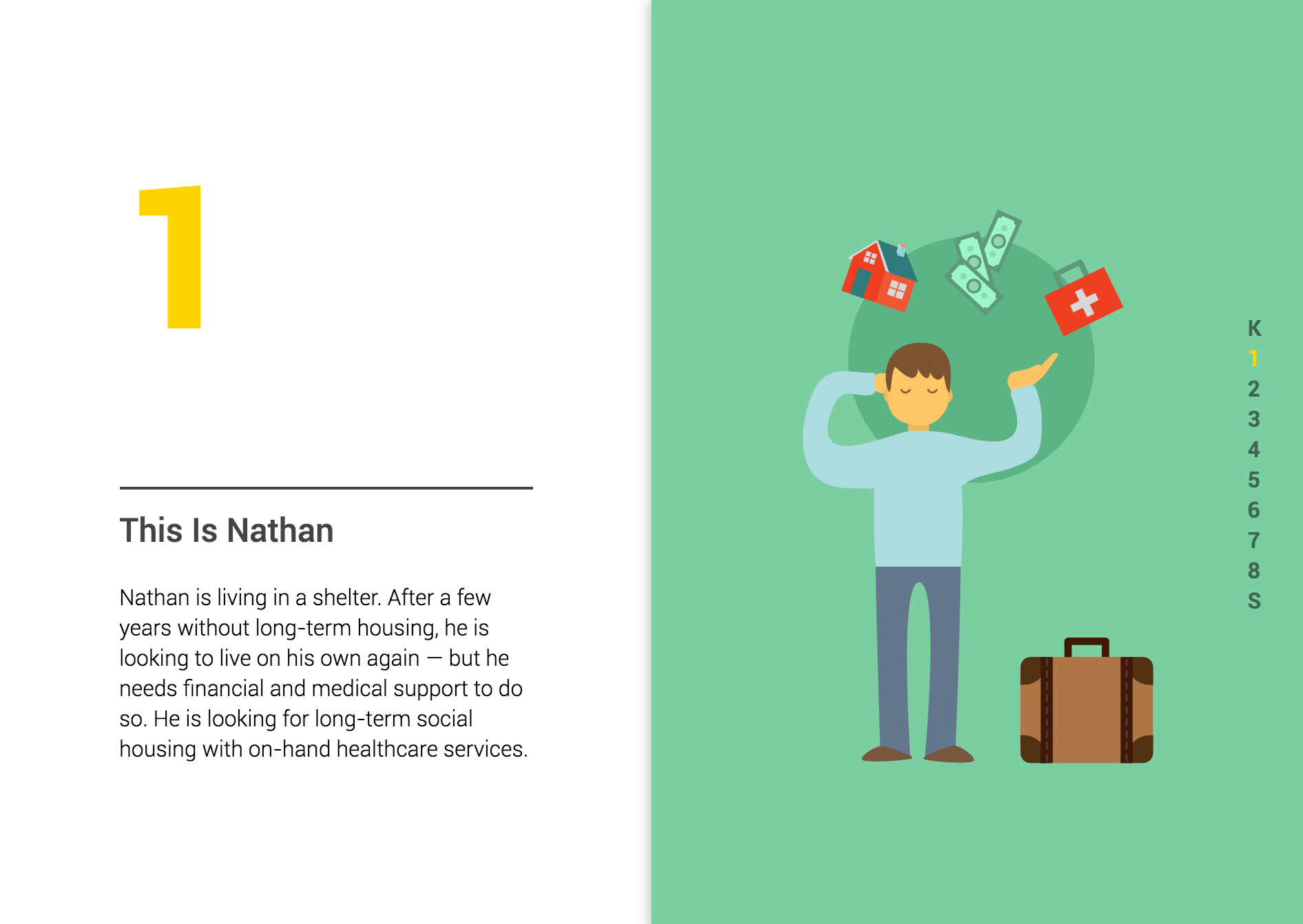
Visit the KeepSafe minisite to see how KeepSafe helps Nathan reach his housing goals.
I was involved in many aspects of the design process during this project. In the beginning, I focused on online research, which helped us to better understand the needs and habits of our intended users. Later, we decided to give the two junior members of our team the responsibility of designing the final visual elements of the interface. This allowed myself and another senior student to focus on information design, task flows, and other higher-level elements of the design. As part of that process, I produced low- and high-fidelity wireframes for other members to use as guides while designing the visual elements. Finally, I created the KeepSafe minisite to present our project during our class showcase.
Timeline:
6 weeks – Spring 2017
Class:
IAT 334 – Interface Design
Team:
Alex Honeywell, Fran Breden, Rocky Shah, and Gabriel Hendry.
As the final project for an Interface Design class, we wanted to take on a serious problem, and propose a service that could have a social impact in our community. Given the homelessness is one of the biggest social issues in Vancouver, we decided to work within this realm.
We began by conducting several phone interviews with representatives at BC 211, a government organization that provides information on community and social services. They receive dozens of calls every day from homeless people looking to find out which shelters have space available for the night, and use a seemingly antiquated PDF system to direct the homeless to shelters with available beds according to their individual needs.
We arranged an in-person interview and office tour with one of the directors of BC 211. While we saw potential for a digital intervention, the system they used was actually quite efficient. We wanted to make sure we were solving for an actual need and not just designing an interface to satisfy the requirements of the project.
Though it was a dead end, this research did lead us towards homeless shelters. We conducted phone interviews with caseworkers, who work directly with homeless people in shelters to create a plan for them to find permanent housing. At the same time, we continued in-depth online research on several key questions, including how and for how long people become homeless, how people get out of homelessness, what the barriers are to doing so, and technology use among the homeless, to develop a better understanding of the issues.
Additionally, from an in-person interview with Amber, a caseworker at a homeless shelter, we learned that:
The first point was corroborated by online research findings that “many social workers say they spend between 20% and 30% of their time regaining lost documents.” Clearly, the fragmented system of storing and sharing documents needed to be addressed. And because most of Amber’s clients had mobile phones, we saw this as a real opportunity to intervene with a digital solution. At the same time, we understood the importance of the human factor in the process, and so the goal of our solution was not to replace the caseworker, but complement them.
Keeping documents safe and accessible means reaching housing sooner. Instead of relying on organizations to store local photocopies of documents, the homeless could store documents digitally, making them the primary holders of these copies. This would also allow progress made with one caseworker to be preserved for future relationships. We used a service blueprint to identify points where our solution could intervene.
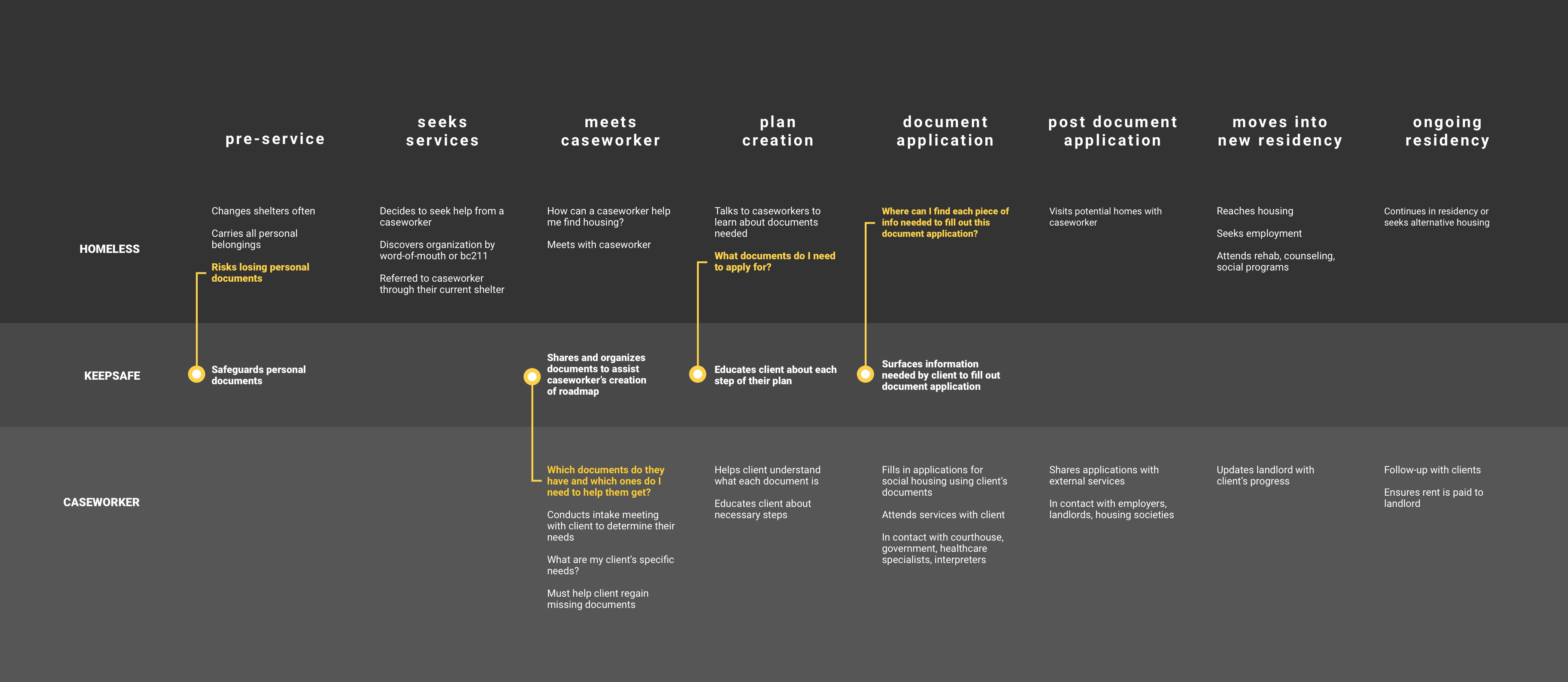
Service blueprint
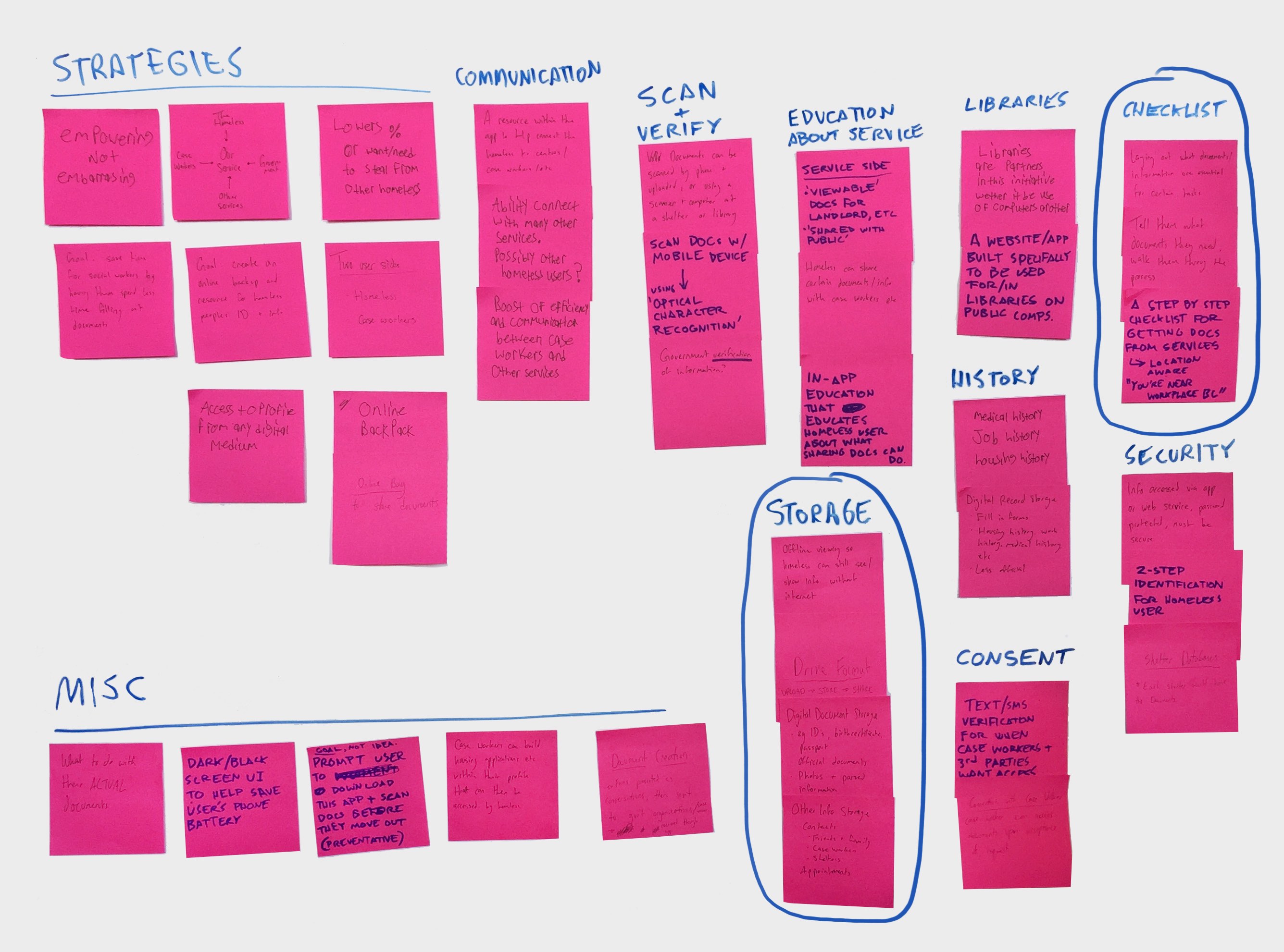
With the key touchpoints defined, we brainstormed a number of feature ideas. We used affinity mapping to group them, and identified what we wanted to be our two primary focuses:
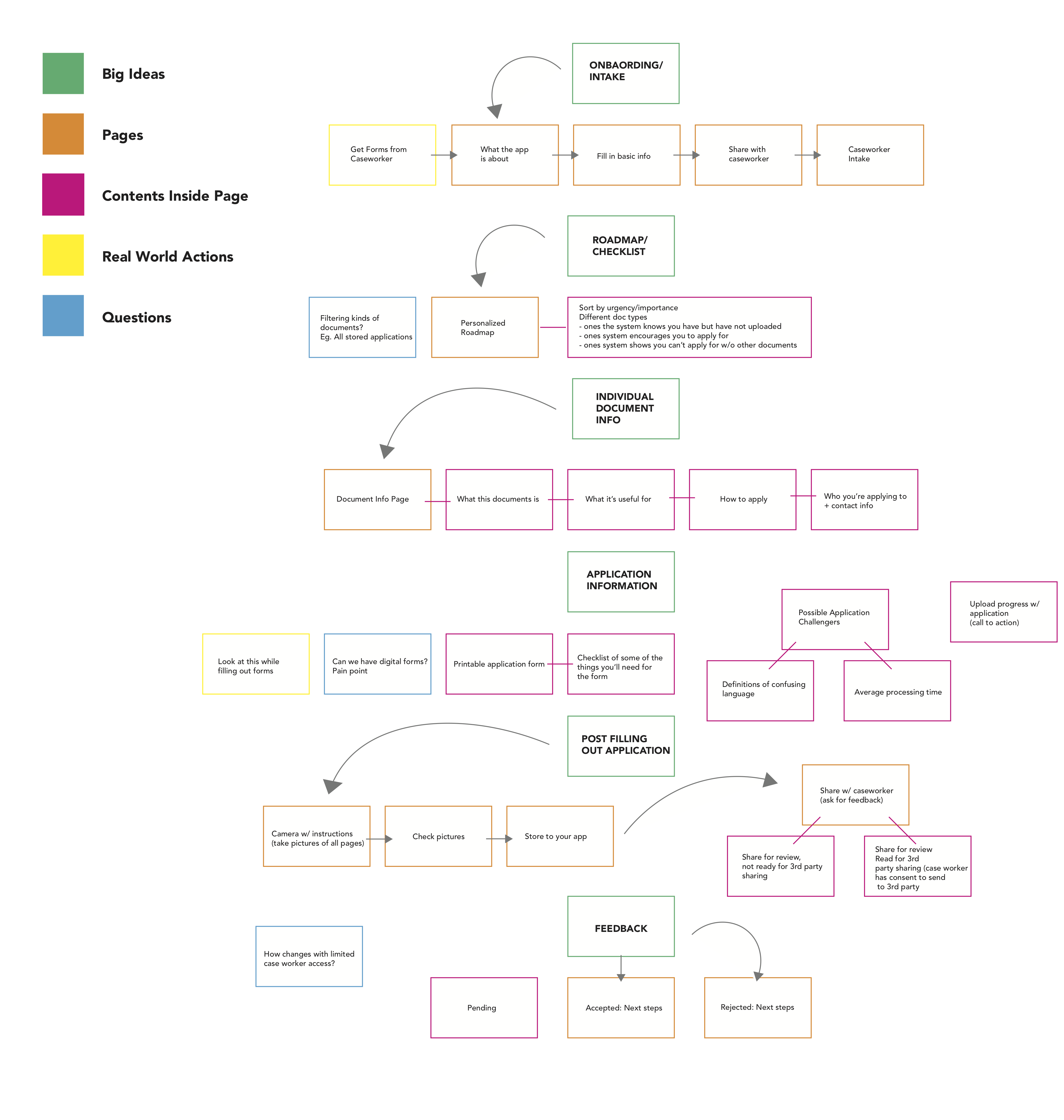
Based on those two focuses, we began defining the high-level information architecture of the app, considering the key flows and the contents contained within.
We then moved on to sketching initial concepts for different features of the app, like a document browser and view, shown below.
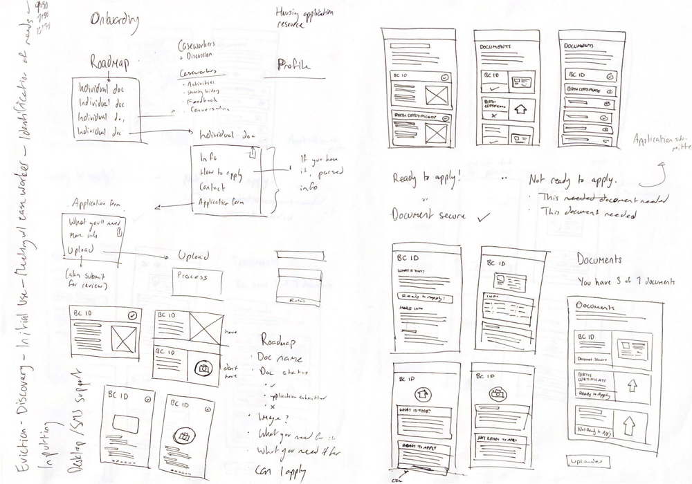
In tandem, we began mapping out flows associated with important tasks, like uploading or applying for a document. It was important to consider the different states that could be involved, like whether a user does or doesn't have a document or error states, and determine how the interface would be affected.
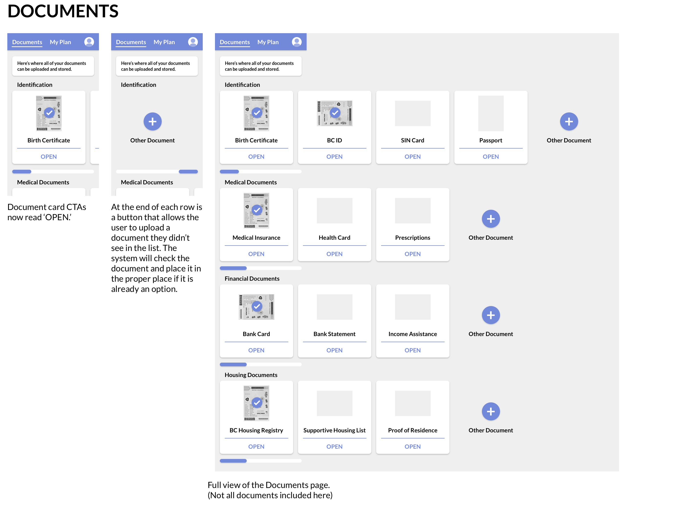
What emerged was a design based on cards, representing individual documents, broken down into the two sections identified through our Affinity Map – All Documents and My Roadmap. Below, you can see selection of wireframes showing the general design progression of a single screen — the Documents page. A variety of layouts including both text and images were explored.
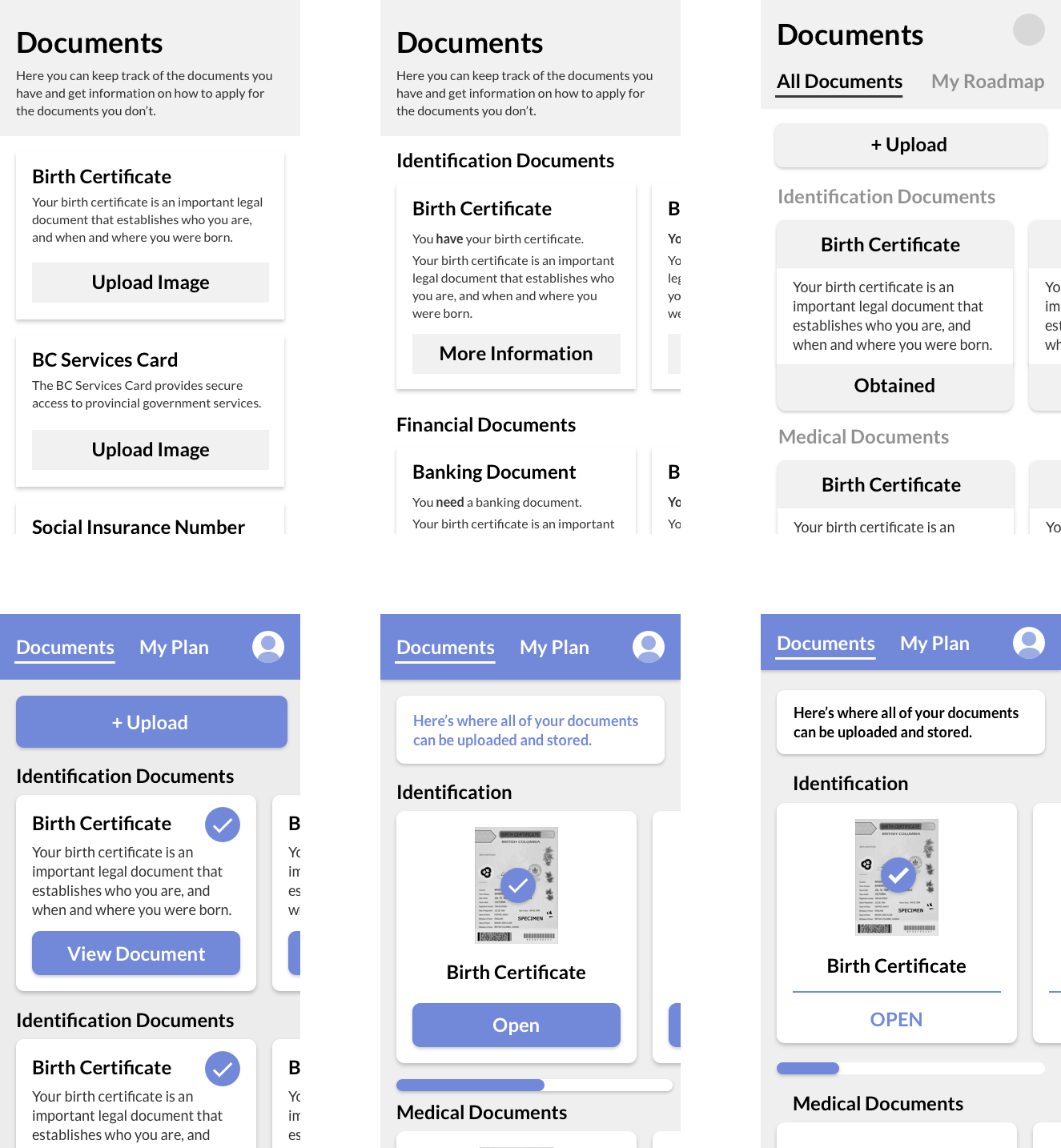
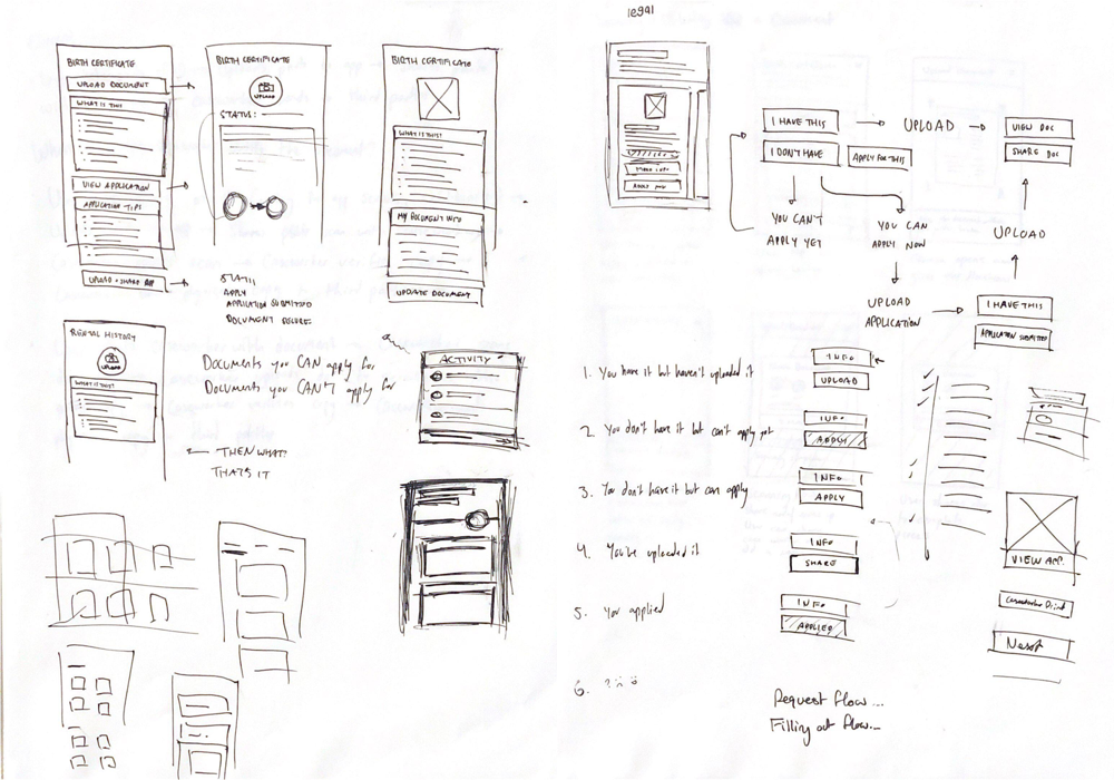
Once we had defined our information architecture, I created higher-fidelity mockups for several app areas and key flows, like applying for a document (Image 3 below) or connecting with a caseworker (Image 2, top right).
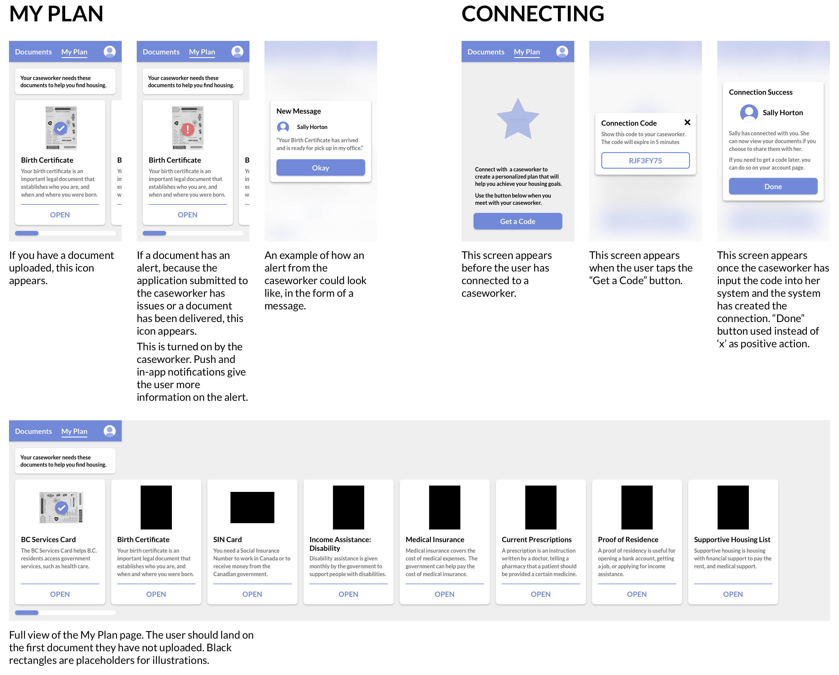
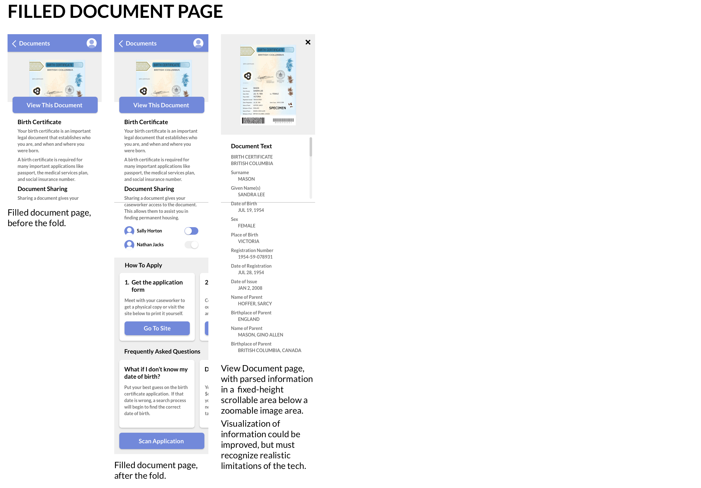
One important aspect of this process was to consider multiple states of a page or element. For example, how would an individual document page look different if the document had been uploaded, versus if it had not yet been uploaded yet? (Images 3 & 4) Or how does the My Plan page appear before the user has connected to their caseworker, and how does it encourage them to connect? (Image 2, top right)
It was also important to design the full extent of every screen, to show what is hidden beneath the fold at both the bottom and right, and to give all group members a better high-level understanding of the layout of all of the elements of the service and how they are connected.
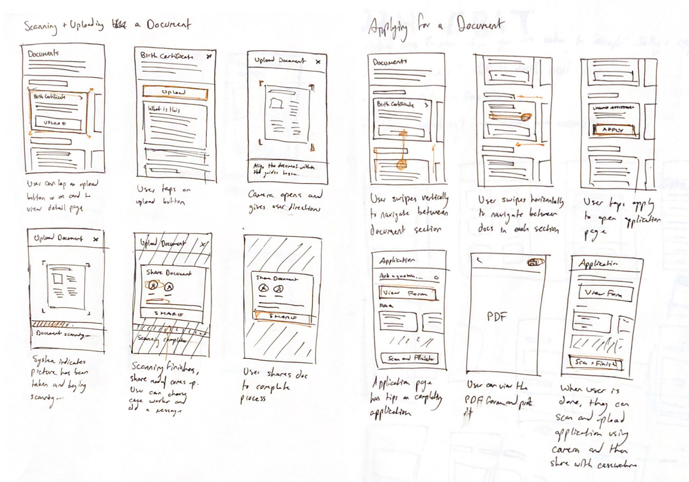
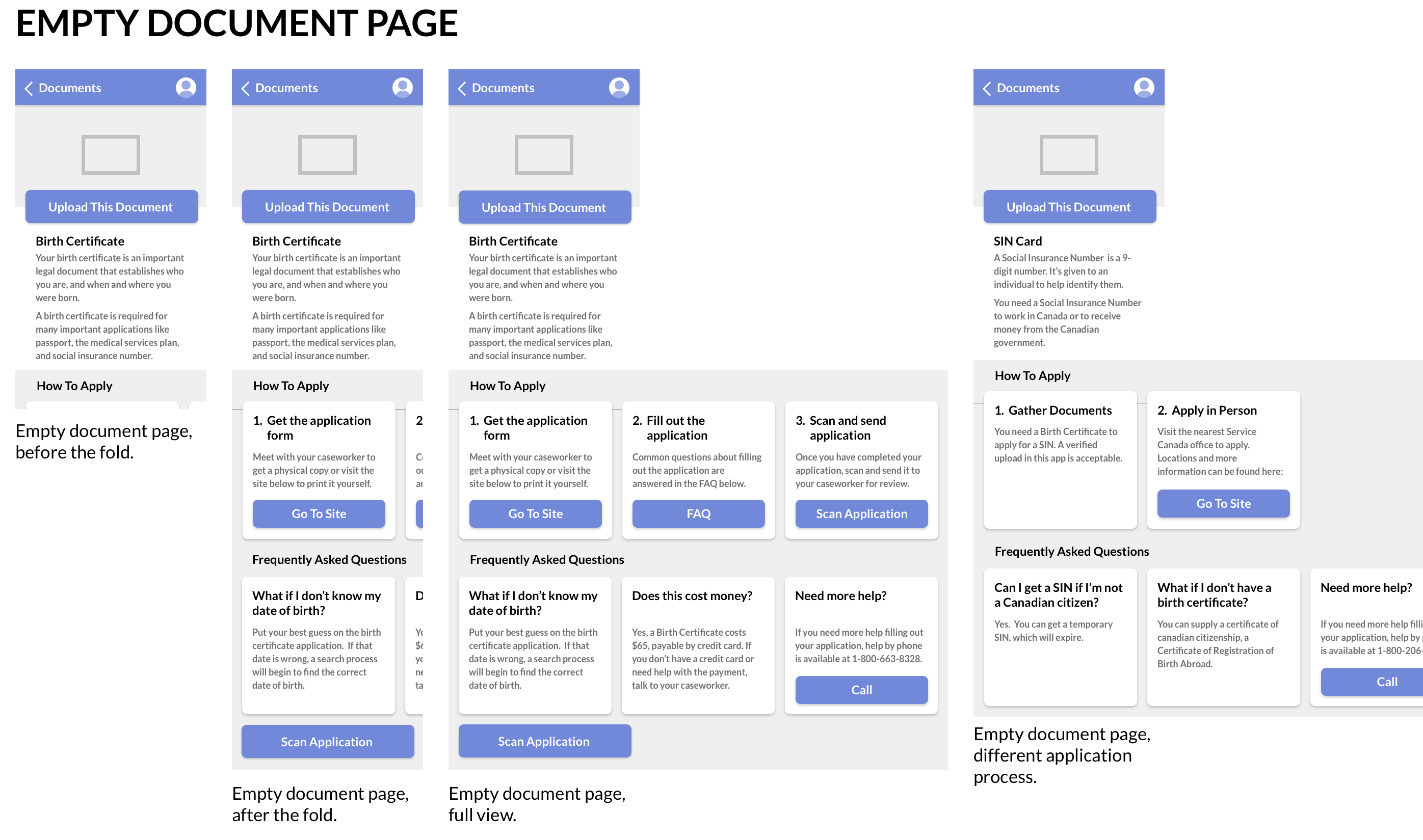
One key change resulting from our usability testing was to the application process. Originally, the application process was entered to from the document page and was designed as a linear flow that stepped the user from screen to screen. While this seemed intuitive at first, usability testing revealed many flaws with this, including that it was unclear to the user what further steps were contained in the flow. It also became clear that users wouldn't necessarily need to be starting at Step 1 (If they had already obtained the application form, for example), so they should not be forced through steps that were not relevant to them in the moment.
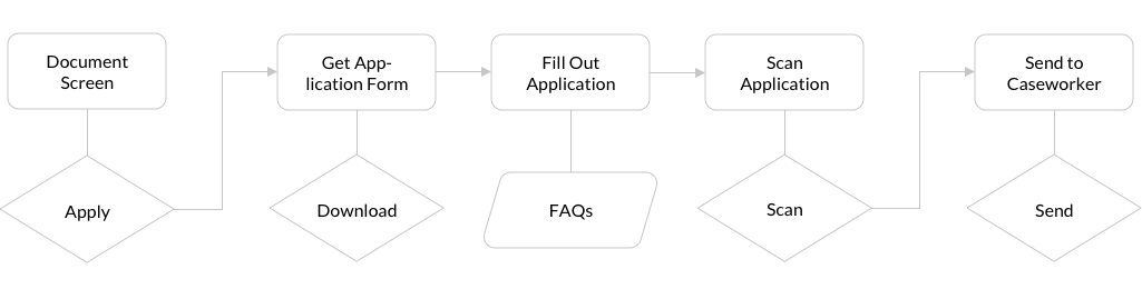
The flow of the process of applying for a document before usability testing. Note the linear from each step to the next.
To fix these issues, I pulled the steps out of the flow and into the top level of the document page. This allows users to get an idea of the entire process without feeling like they are committing to something they do not fully understand, and minimizes the number of taps required to get to a given action. The step numeration was added to make it clear that the end goal was sharing the application with their caseworker, and the structure allows the user to skip over anything that was unecessary to them.
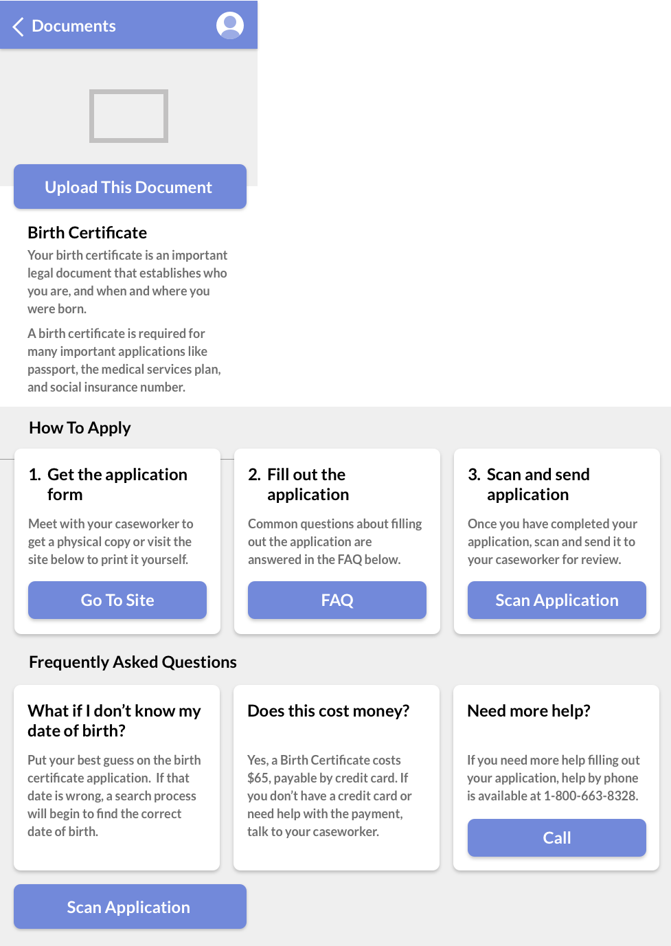
Final mockups I created for the Document screen, including the apply process, prior to final UI implementation.
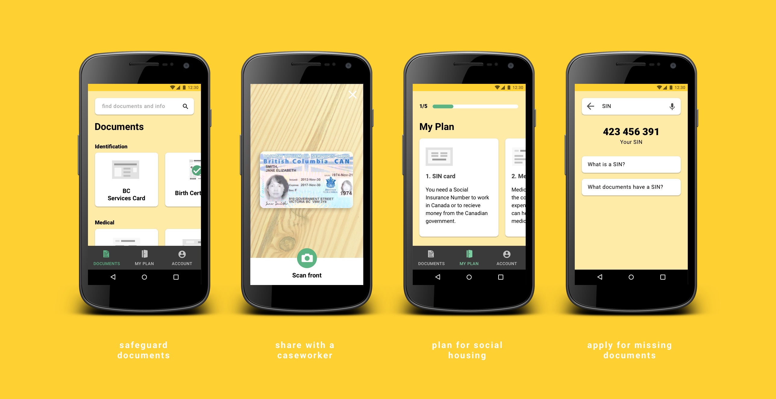
To safeguard against the risk of losing important documents, KeepSafe provides a secure place to store and access digital copies. Users can swipe through an uncluttered page of document cards, sorted into categories. On each document page, users can learn more information about the document if they don't have it, and upload photos if they do.
To help caseworkers learn about their client's situation more efficiently, the user can choose to share their documents with chosen caseworkers using an access code. This puts the power of consent in the hands of the user.
The caseworker can then create a plan for their client that clarifies what documents they need to attain in order to achieve their housing goal. This is presented to the user in the "My Plan" section of the app. Each step breaks down the process of obtaining the document and educates the user on why it is necessary. KeepSafe also allows users to photograph and upload application forms for submission to their caseworker for review. As they don't have to book and wait for an appointment, this speeds up the application process.
Given that it could be difficult to locate specific information needed for applications, and that the user may come across terms they may not be familiar with in the process, KeepSafe makes information searchable from the documents page. Searching was originally contained within individual document pages, but user testing revealed a desire for it to be accessed from the highest-level screen.
Individual document pages contain an overview of how to apply for the document, broken down into steps. These steps link to important resources including the application document and frequently asked questions.
Over the course of this project, much research was required in order to define a problem that was both real and solvable on our end as interaction designers through designing a digital interface. In the end, we developed a service that feels like it has the potential to, at least in part, solve the problems we set out to solve.
An important thing we discovered about the interface design process is that we often make assumptions in creating flows, possibly only solving for one use case, and this is one of the reasons that user testing is so important. We created a flow for downloading, filling out, and uploading applications that was linear and felt natural to us, as it limited options for the user. But testing revealed that users would not know to navigate to that flow in the testing situation we created, leaving important options hidden within it. So, we decided that all options should be available within one layer of the where the user starts in the interface.