From January to August 2018, I worked as a UX designer on the SAP Jam team at SAP Labs Vancouver.
SAP Jam is an enterprise collaboration software with over 50 million registered users. It brings together employees of an organization, as well as partners, allowing them to collaborate through groups, content creation, document sharing, and a feed of updates to solve problems faster and drive results within their business.
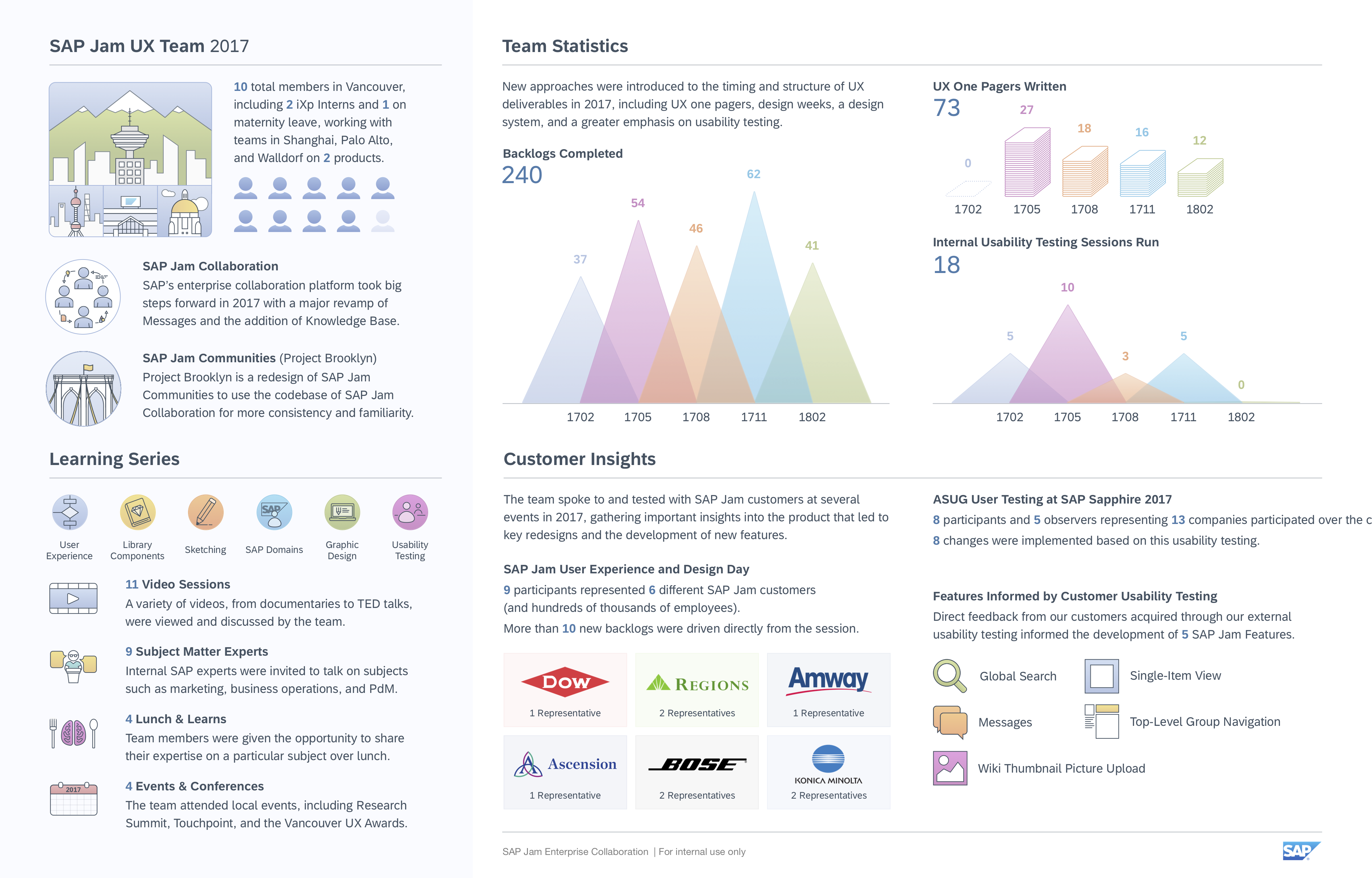
An infographic created by myself and my intern partner, Nathan. All illustration except the circular "Learning Series" icons created by me.
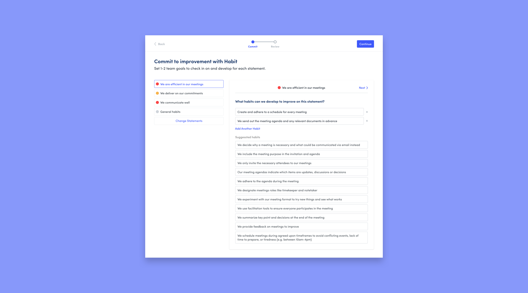
As we introduced second-level replies to the feed, I saw a big opportunity to improve the overall design of feed comments. The main goals of the redesign (below, right) were to reduce visual clutter, increase clarity, and reduce overall height.
I redesigned feed posts and comments as part of the introduction of second-level replies. Left: Existing beta design. Right: Final production design.
Important changes included... Show
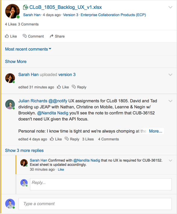
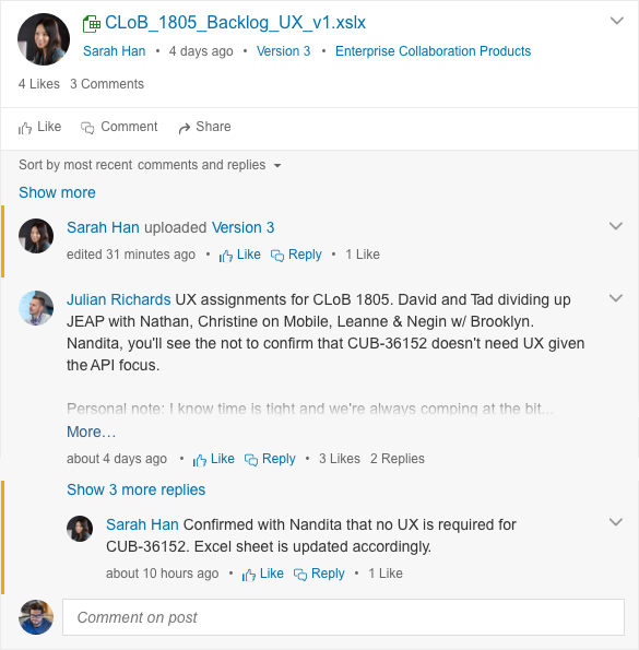
Another challenge we encountered while rolling out the new feed was how to show the “Best Answer” to a question in the feed. The requirements of the backlog were to support 2nd-level replies as Best Answers as we transitioned to the new feed. I took this as an opportunity to redesign how all Best Answers were shown in the feed.
In the old design, the Best Answer was moved to the top of the thread, losing the context of any comments that came before it. This would be especially problematic if the Best Answer was a Reply to another comment, which was functionality we were preparing to introduce.
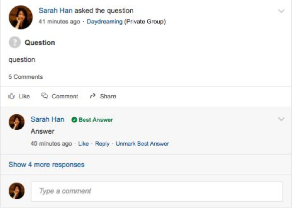
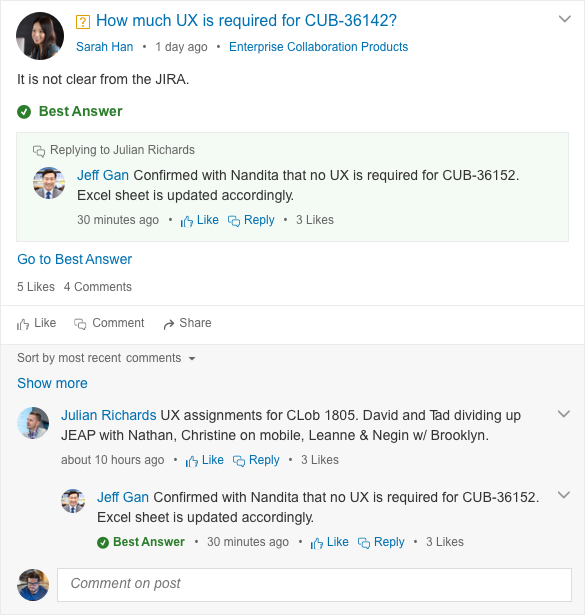
I redesigned how Best Answers appeared in the feed. Left: How best answers were shown previously. Right: The new design for Best Answer as a reply.
The main thing I wanted to accomplish with the new design was to present the Best Answer more prominently as a direct response to the question, while also not losing its place in the thread. With the new design, a user scanning the feed does not even have to look to the comments section to find the answer – the question and answer are presented as one complete unit. And although it is presented above, the Best Answer still lives in the comments section as well, allowing the user to see the answer in the context of the comments and replies around it.
When the Best Answer is a Reply to a comment, there is an indicator, which is an important cue to the user that there may be more context to this answer in the comments below. Also, previously, the Best Answer was bubbled to the top of the comments in the feed, but not in Single Item View. The new design was able to be incorporated into Single Item View, which was important for consistency of the UX across the product.
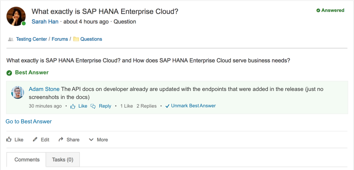
I also redesigned how Best Answers appeared in Single Item View to be more consistent with how they appeard in the feed.
Another issue raised by customers was the fact that, on mobile, all of the comment attachment options were hidden in a dropdown. This impacted the discoverability of these actions and thus some users were unaware of the options they had on mobile.
The MVP was to surface two of the actions outside of the dropdown. This was a limitation based on space constraints due to the size of the Post and Cancel buttons. But, we also wanted to explore designs that allowed us to show all five of the icons, as this would be a big improvement to the UX, but would require a greater rethinking of the comment box.
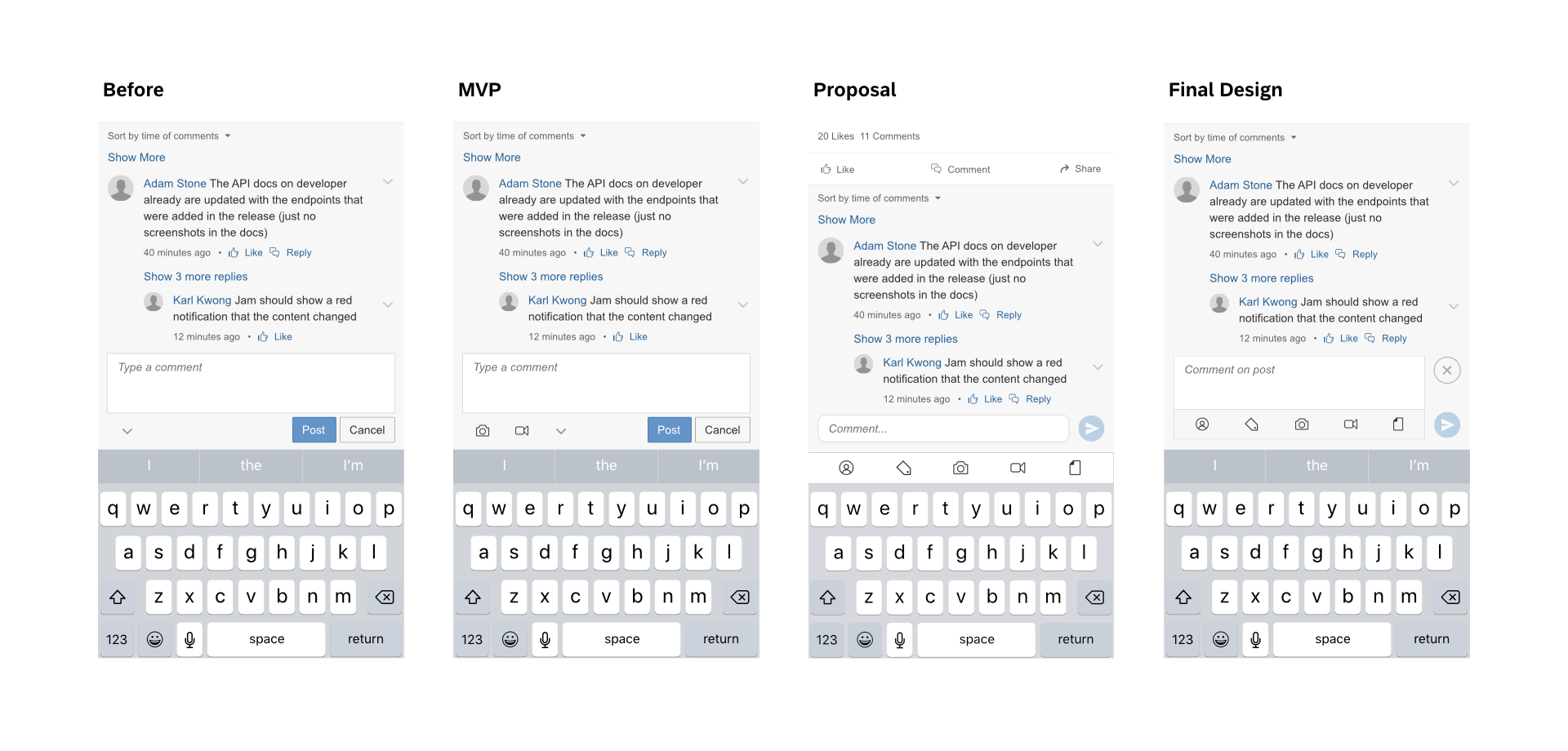
An early recommendation I made was to move the actions into a toolbar that was sticky to the keyboard. Unfortunately, this was not accepted by the dev team due to its cost. The limitations imposed by developers due to technical feasibility, and the amount of hours they have, are just another set of constraints that we have to deal with as designers.
So, we arrive at the final design, which was a bit of a compromise. The biggest change from the “Before” design to the final design was switching to smaller icon buttons, specifically borrowing the “Post” button from the “Send” button in SAP Jam messages. Stacking the two buttons at the side of the comment box gave us enough horizontal room to surface all five action icons, eliminating the dropdown.
I had the opportunity to work on a vision for the future of SAP Jam. Using the SAP Fiori 2.0 design guidelines – which were not integrated into SAP Jam – I, along with another designer, proposed a new visual identity for SAP Jam while addressing some key deficiencies in the product. Our proposal focused on the home screen, with a focus on the header as an element that would be constant across the whole product, as well as integrations with other SAP services.
The existing header had icons for Tasks, Messages, and Notifications, though the behaviour differed between them. While clicking on Notifications produced a dropdown, clicking on the other two would unexpectedly navigate the user to the page. To remedy this, I designed new dropdowns for all three using the new design language. I also redesigned the user dropdown to integrate several navigation buttons that previously had all taken up their own space.
In addition to an overall cleaner look to the feed and sidebar, we also explored the idea of a dashboard where users or organizations could customize quick links to groups, pages, actions, and more. Once the mockups were complete, I created the interactive prototype above to share with product managers.
I just want to show a few of the highlights here, but if you are interested, I'd be more than happy to discuss my time at SAP in greater depth with you!