The following work was done for a design challenge within an 8-hour timeframe. For this exercise, the brief was as follows:
"Design an experience for students to discover orientation events and craft a visual system to accommodate different types of events: sports, music, visual arts, social groups, and volunteering events. Provide high-fidelity mocks for searching, browsing, and viewing the details for these different events."
I decided to go with this option over the others because of the prompt to “create a visual system.” Last year, I spent a good amount of my time at SAP working on a shared asset library and design system. I also had the opportunity to attend a design workshop about Flexible Design Systems, so the possibility of including these ideas intrigued me.
I also decided to create this experience for mobile, as I figured it would be the most convenient medium for an active student on campus to explore orientation events.
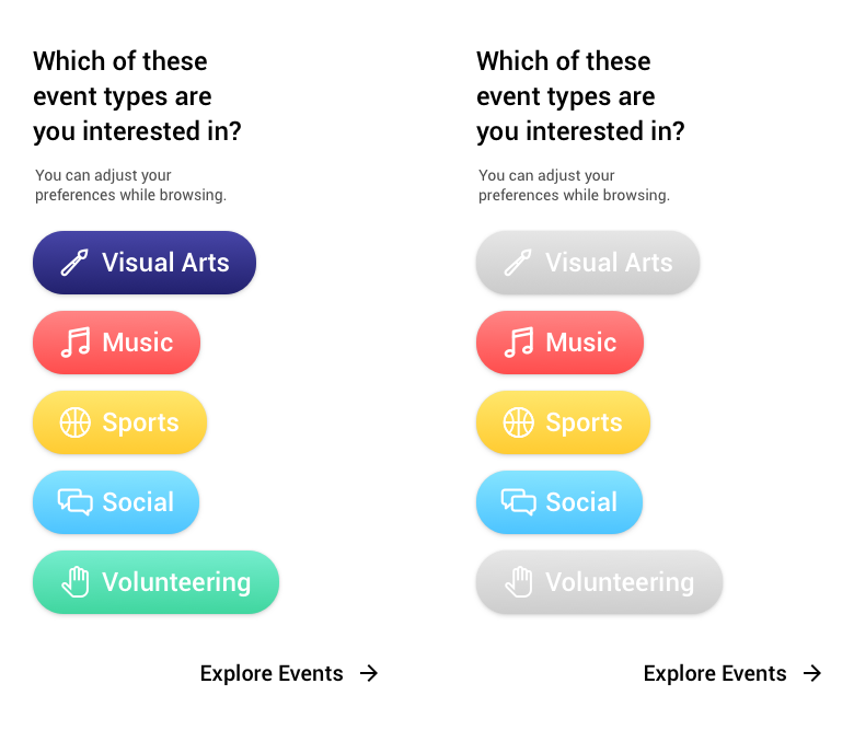
I started by thinking about how I would distinguish the event types – icons, for one, but using color also felt important. I picked a set of five bold and distinct colors, and then created simple icons for each category (from left to right: Visual Arts, Music, Sports, Volunteering, Social).

When the user enters the experience, they are first introduced to the five categories and their corresponding colors. If there are any event types they are not interested in, they can deselect them here. This screen also lets them know that they can adjust their preferences later, too. The right screen shows what the options look like if they have been deselected.
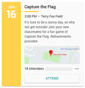
I began this process by thinking about what information each card should contain. It made sense for each event to have a title, date, time, location, description, and indication of its category. Additionally, if an RSVP system was theoretically integrated, the number of attendees would be great information for both organizers and students to have.
That being said, that didn’t mean the user had to see all of this information right off the bat. So, I set out to create multiple variations of a base card that gradually revealed more information to the user, and could be used in different circumstances.
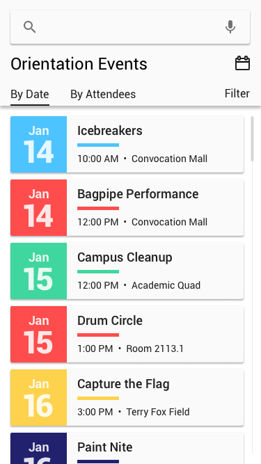
My initial indication of category was just the colored line underneath the title. After several iterations, I added a colored square on the left side of the card to show the category icon. But then I realized the indication of category didn’t have to be so heavy-handed. I decided to replace the icon with the date, and liked the way that it made it easy to scan many cards by date, and not just by title.

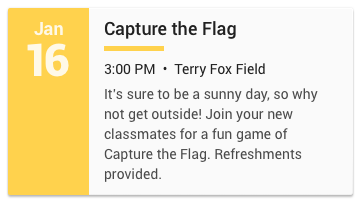
As you can see, the basic card contains only the most essential information – title, date, time, location, and category. I felt like all these were essential for the user to be able to quickly determine their interest and whether or not they would be able to attend.
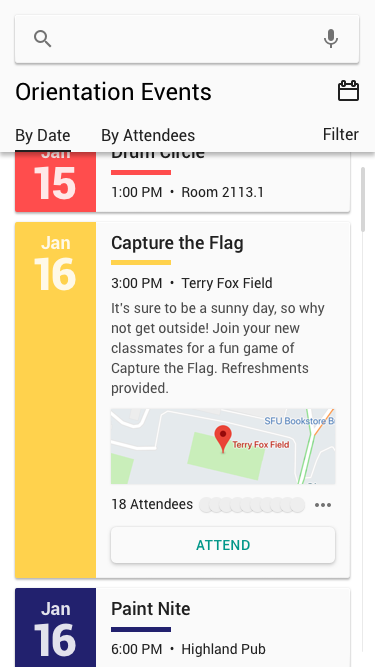
The largest card’s additional information includes the description, a map, the number of attendees (and who is attending, in low-fidelity here), and a CTA for RSVPing to the event – all important, but not necessarily needing to be viewed at first glance.
I also created a middle-ground card that could be used in situations where including the description on the first level would be beneficial, but including all information may still be too much.
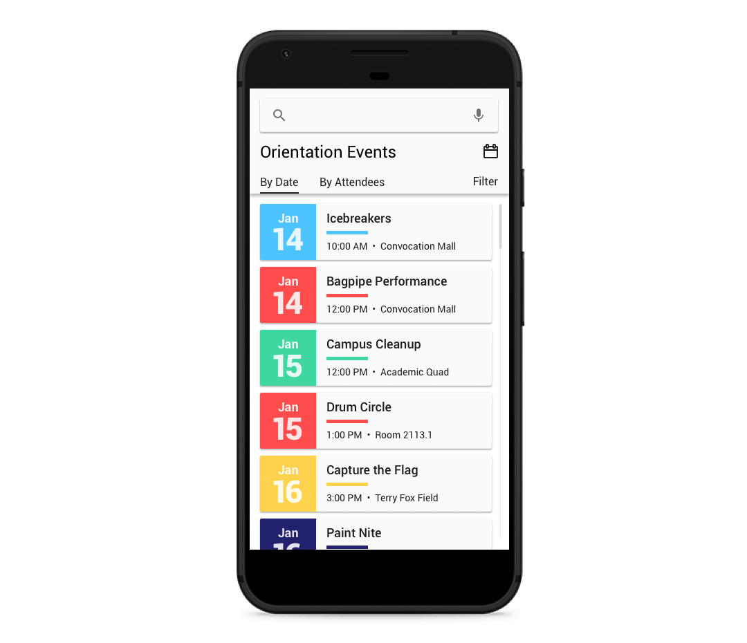
After the user passes through the Filter screen, they arrive in the event browsing area. I purposefully kept the header very neutral, as I didn’t want to introduce any additional colors that would clash with the event type colors.
Below the header is a scrollable list of events, organized initially by date.
Tapping on any card expands it to show more information, and allows the user to let the organizers (and other users) know if they will be attending the event.
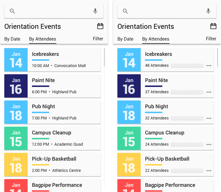
The user can also choose to see the events ordered by number of attendees, if they are more interested in the events that have the most people going to them. On the right, I experimented with the flexible design system idea of promoting different information based on context, in the case showing the attendees in the meta line instead of the time and location. This would give more indication to the user as to why the cards were ordered how they were. However, I felt it hurt the user’s ability to quickly determine whether they would be able to attend an event. Users would have to expand event cards just to see the time and location, whereas I doubted many users would expand the cards simply to view the number of attendees. The purpose of this view was simply to bring the most popular events to the top, and the first option was successful at that.
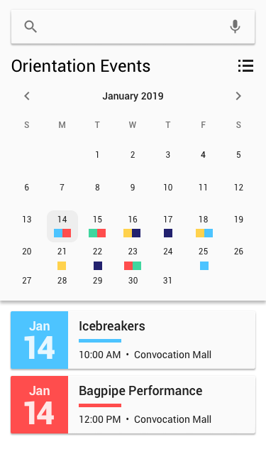
I included one more way to view the events, reached by the calendar icon at top right. The calendar uses miniature versions of the colored squares from the cards to indicate which type of events are happening on each day. By tapping a date, the user sees the corresponding event cards at the bottom.
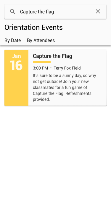
The search bar lives in the header at the top of the screen. Once a term is searched, the user can still choose to sort by date or attendees, if applicable. I chose to incorporate the medium-sized card in this screen, as through searching the user is narrowing down options, and may be interested in the difference between similar events.
I tried not to overdo it with information, so not every aspect of my process was included. Feel free to ask me any questions about my process or final design choices. Thanks for reading!